AI Website Design Flaws Often Hide Mobile Breakdowns
In a rush? Here's the wrap!
AI-generated website layouts promise efficiency but frequently deliver broken experiences on mobile devices, directly impacting your sales and brand reputation. We show you why these seemingly perfect designs fail when it matters most: in the hands of your users.
In This Article
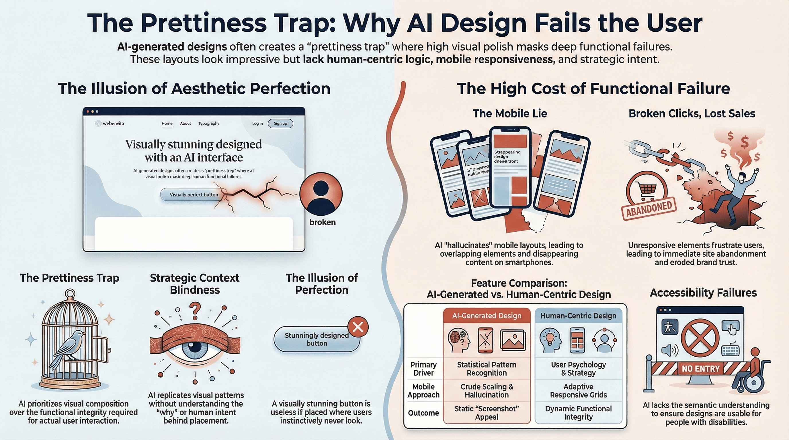
The 'Prettiness' Trap: AI Builds for the Screenshot, Not the User
When you first see an AI-generated website layout, it can be incredibly impressive. The colors are harmonious, the typography is clean, and the overall aesthetic often looks polished and modern. This initial impression creates a 'prettiness' trap, where the visual appeal of a static image masks fundamental flaws that only emerge during actual interaction. AI models are trained on vast datasets of existing designs, learning to replicate patterns that look good, but they often lack the underlying understanding of why those patterns work for a human user.
This superficial understanding means AI prioritizes visual composition over functional integrity. It generates layouts that are optimized for a screenshot, a static representation, rather than a dynamic, interactive experience. You might see beautifully arranged elements, but when a user tries to click a button, fill out a form, or navigate a menu, the entire experience can fall apart. The design might look like a website, but it doesn't behave like one, leading to immediate frustration and abandonment.
The true test of any website isn't how it looks in a portfolio, but how effectively it guides a user to achieve their goal. If your customers encounter broken links, unresponsive elements, or confusing navigation, that initial 'pretty' impression quickly turns into a significant barrier. This directly impacts your bottom line, as potential sales are lost and your brand's credibility erodes with each user's negative interaction. We must look beyond mere aesthetics to the deeper functionality.
Beyond the Static Image: The Illusion of Perfection
AI's strength lies in pattern recognition, allowing it to assemble components in visually pleasing ways. However, it struggles with the nuanced, human-centric aspects of design that ensure a seamless flow. It doesn't inherently understand the hierarchy of information, the typical user's mental model, or the psychological principles that make an interface intuitive. This results in designs that are visually coherent but functionally arbitrary.
Imagine a website where the call-to-action button is perfectly centered and beautifully styled, but it's placed in a location where users instinctively don't look, or it doesn't respond to a tap. The AI saw a button and placed it, but it didn't understand the intent behind the button. It created an illusion of perfection that vanishes the moment a user tries to engage with it. This disconnect between appearance and action is a significant hurdle for user satisfaction.
This illusion is particularly dangerous because it can delay the discovery of critical issues. A stakeholder reviewing a static mock-up might approve a design based solely on its visual appeal, unaware of the impending user experience (UX) nightmares. It's only when the design is implemented and tested by real users, often post-launch, that the true extent of these functional shortcomings becomes apparent, leading to costly reworks and missed opportunities.
The Cost of a Broken Click: Lost Sales and Trust
Every broken interaction on your website represents a lost opportunity. A customer trying to add an item to their cart, sign up for a newsletter, or contact support will simply leave if the process is difficult or impossible. These aren't just minor inconveniences; they are direct roadblocks to conversion and customer retention. Your website is often the first, and sometimes only, direct interaction a potential customer has with your brand.
When a site fails to perform its basic functions, it communicates a lack of care and professionalism. This erodes trust, a fundamental asset for any business. Users quickly associate a frustrating digital experience with the brand itself, leading them to seek competitors who offer a more reliable and user-friendly platform. The cost of a broken click extends far beyond the immediate transaction; it impacts long-term customer loyalty and brand reputation.
Ultimately, the goal of any website is to serve its users and achieve business objectives. If AI-generated designs prioritize superficial prettiness over functional integrity, they become liabilities rather than assets. We must ensure that the tools we use create experiences that are not only visually appealing but also robust, intuitive, and effective in driving desired outcomes.
The Mobile Lie: When AI Hallucinates Layouts
One of the most significant AI Website Design Flaws manifests acutely on mobile devices. AI models, while adept at generating desktop-optimized views, frequently struggle with mobile responsiveness. They often 'hallucinate' elements that appear correctly on a larger screen but completely break, overlap, or disappear when viewed on a smartphone or tablet. This isn't just a minor glitch; it's a fundamental failure that renders the website unusable for a vast segment of your audience.
AI's training data might include many responsive designs, but its generative process often fails to apply the complex rules and breakpoints necessary for truly adaptive layouts. It might place elements based on their desktop positions, then attempt a crude 'scaling down' rather than a thoughtful re-arrangement for a smaller viewport. This leads to hallucinated layouts where text runs off the screen, images are disproportionately large, or interactive elements become unclickable due to overlapping content. The AI effectively lies about the design's adaptability, a common trait when unmasking AI website scams.
The promise of a website that works everywhere is crucial in today's mobile-first world. If your AI-generated design looks pristine on a laptop but falls apart on a phone, you're alienating a massive user base. This isn't just about convenience; for many users, mobile devices are their only way to access the internet. A broken mobile experience means a broken business opportunity, and it's a critical flaw that often goes unnoticed until it's too late.
Overlapping Elements and Disappearing Content
The most common symptom of AI's mobile responsiveness failures is the chaotic rearrangement of elements. You'll see text boxes overlapping images, navigation menus extending beyond the screen, or critical calls-to-action becoming obscured by other UI components. This isn't just an aesthetic issue; it makes the content unreadable and the site impossible to navigate effectively. Users cannot engage with a website if they can't see or interact with its core features.
Even worse, some content might disappear entirely. An AI might decide that certain elements are less important on mobile and simply hide them, or its responsive logic might fail to render them correctly in a smaller viewport. This means your carefully crafted messaging, product details, or contact information might be completely inaccessible to mobile users, leading to significant user experience (UX) nightmares and missed conversions.
These issues stem from the AI's inability to truly understand the spatial relationships and interaction patterns required for different screen sizes. It can place objects, but it struggles with the dynamic constraints of a responsive grid system. A human designer anticipates these challenges and designs with breakpoints and flexible layouts in mind; AI often treats each view as a separate, albeit related, static composition.
The Unseen Gaps in Mobile Responsiveness
Beyond visible overlaps, AI-generated designs often suffer from subtler, yet equally damaging, issues in mobile responsiveness. Touch targets might be too small or too close together, making it difficult for users with larger fingers to accurately tap elements. Form fields might not automatically trigger the correct keyboard type (e.g., numeric for phone numbers), adding friction to data entry. These are small details that accumulate into a frustrating experience.
Another critical gap is performance. AI-generated layouts might include heavy images or complex animations that work fine on a desktop's robust internet connection but cripple load times on mobile data. This leads to slow, unresponsive pages, causing users to abandon the site before it even fully loads. A design isn't truly responsive if it's technically adaptable but practically unusable due to performance bottlenecks.
These unseen gaps highlight that mobile responsiveness is about more than just rearranging elements; it's about optimizing the entire experience for the constraints and opportunities of mobile devices. AI currently struggles to address this holistic view, often providing a superficial solution that fails to meet real-world user needs. We need a more thoughtful approach to deliver truly effective mobile experiences.
Context Blindness: AI's Lack of Human Understanding
AI's generative capabilities are powerful, but they operate without genuine comprehension of context, purpose, or human intent. When an AI places a button or a navigation bar, it does so based on statistical patterns from its training data, not because it understands why that element needs to be there or how it contributes to the user's journey. This context blindness is a core AI Website Design Flaw that leads to designs that are visually plausible but strategically incoherent.
Human designers make choices rooted in user psychology, business goals, and established usability principles. They consider the information hierarchy, the user's likely path, and the desired emotional response. AI, in contrast, extrapolates. It sees that many websites have a navigation menu at the top and a contact form at the bottom, so it places them there. It doesn't understand the strategic reasons behind those placements, nor does it adapt them for unique business models or target audiences.
This lack of contextual understanding results in generic UI that, while visually acceptable, lacks the strategic depth and purposeful design that truly differentiates a brand and guides users effectively. It's like a perfectly assembled puzzle where none of the pieces connect to form a meaningful picture. The elements are there, but their arrangement doesn't serve a higher purpose, leading to a bland and often ineffective user experience.
Why a Button Belongs Where It Is
Every element on a well-designed website serves a purpose, and its placement is deliberate. A call-to-action button, for instance, isn't just a stylistic choice; its color, size, text, and position are all carefully considered to maximize visibility and encourage interaction. This involves understanding visual hierarchy, user flow, and even cognitive load. AI, operating without this depth of understanding, often places elements in a statistically probable location rather than an optimally strategic one.
For example, an AI might generate a product page where the 'Add to Cart' button is visually appealing but located far below the fold, or it's indistinguishable from other decorative elements. While it 'looks good' in isolation, its placement actively hinders the user's ability to complete a purchase. A human designer would understand the critical importance of that button and ensure its prominence and clear positioning within the user's immediate field of vision.
This is where the difference between generating a design and designing with intent becomes clear. AI can replicate visual patterns, but it cannot replicate the strategic thinking that dictates why a button belongs in a particular spot to facilitate a specific user action. This leads to designs that are aesthetically pleasing but functionally suboptimal, creating user experience (UX) nightmares for visitors trying to navigate the site.
The Pitfalls of Generic UI
The reliance on statistical patterns also means AI-generated designs often fall into the trap of generic UI. While consistency across the web can be beneficial for familiarity, a complete lack of unique character or strategic differentiation can make a brand indistinguishable from its competitors. AI tends to produce designs that are safe and universally acceptable, but rarely innovative or tailored to a specific brand identity or audience nuance.
This can be particularly damaging for businesses looking to establish a strong brand presence online. A website built with generic UI fails to convey a unique story, personality, or value proposition. It looks like countless other sites, making it harder for users to remember the brand or feel a connection. In a crowded digital marketplace, standing out is paramount, and generic design actively works against that goal.
Furthermore, generic UI often fails to address specific user needs or accessibility requirements. While it might adhere to broad patterns, it won't inherently include features for specific demographics or ensure compliance with detailed accessibility failures guidelines without explicit, complex prompting. This leads to a lowest-common-denominator approach that overlooks critical opportunities to create truly inclusive and effective digital experiences for everyone.
The Real Impact: User Experience Nightmares and Accessibility Failures
The cumulative effect of these AI Website Design Flaws is a cascade of user experience (UX) nightmares and profound accessibility failures. When layouts break on mobile, content disappears, or elements are placed without purpose, the user's journey becomes a struggle rather than a smooth path. This isn't just about minor annoyance; it's about excluding entire segments of your potential audience and actively driving away customers.
For users who rely on assistive technologies, AI's context blindness and hallucinated layouts can create insurmountable barriers. If an AI doesn't understand the semantic meaning of elements or the correct ARIA attributes, a screen reader might present a jumbled mess of content, rendering the site completely unusable. This is a severe form of accessibility failures, denying equal access to information and services.
Ultimately, a website's success is measured by its ability to serve its users effectively and efficiently. If AI-generated designs lead to frustration, confusion, and exclusion, they are not serving their purpose. (It is vital to use a strategic analysis tool to verify your site is truly serving your business objectives.) We must prioritize designs that are not just visually appealing but also fundamentally usable, accessible, and aligned with human needs and business objectives. The goal is to build digital products that empower, not hinder.
From Frustration to Abandonment
The path from a frustrating user experience (UX) nightmare to site abandonment is incredibly short. Modern web users have high expectations for ease of use and instant gratification. If a website is slow, difficult to navigate, or simply doesn't work as expected, they will not hesitate to leave and seek alternatives. This immediate bounce rate translates directly into lost leads, lost sales, and a damaged brand reputation.
Think about the cumulative effect: a mobile user trying to make a purchase encounters overlapping product images, an unclickable 'add to cart' button due to poor mobile responsiveness, and a form that doesn't accept their input correctly. Each step adds to their frustration until they simply give up. This isn't just a technical problem; it's a business problem with direct financial consequences that could have been avoided with thoughtful design.
We cannot afford to create experiences that actively push users away. The initial 'prettiness' of an AI-generated layout quickly fades when faced with real-world usability challenges. Our focus must always be on the human at the other end of the screen, ensuring their journey is as smooth and intuitive as possible, regardless of the device they use. This human-centered approach is the antidote to user experience (UX) nightmares.
Ensuring True Inclusion, Not Just Compliance
Accessibility failures are not merely technical oversights; they are ethical shortcomings that exclude people with disabilities from accessing vital information and services. While AI can be prompted to consider accessibility, its inherent context blindness means it often struggles to implement truly inclusive design without significant human oversight and intervention. It might generate elements that look compliant but lack the semantic structure or interactive patterns necessary for assistive technologies.
For example, an AI might place alt text on an image, but if that alt text is generic or uninformative, it still represents an accessibility failure for a visually impaired user. Similarly, keyboard navigation, proper focus management, and color contrast are complex aspects of accessibility that AI often struggles to implement comprehensively, leading to designs that are technically 'present' but functionally inadequate for diverse user needs.
True inclusion goes beyond merely meeting minimum compliance standards; it means designing with empathy and foresight for all potential users. This requires a deep understanding of varied human abilities and the systematic application of inclusive design principles, something that currently remains firmly in the domain of skilled human designers. We must ensure that our digital creations are not just functional for some, but truly accessible for everyone.
Once we have a design that truly works for the user, both visually and functionally, the next critical step is to bring that vision to life through robust engineering. It's in the engineering phase that we build the resilient foundation, ensuring that the elegant solutions we've designed are translated into a performant, scalable, and maintainable product.
Frequently Asked Questions
Need a better website strategy, but don't know where to start?
Answer 10 simple questions about your business, and we'll generate a personalized technical roadmap just for you. Free.
Get My Roadmap
Related posts

Your Mobile B2B Design Needs Engineering Precision
B2B leaders are on their phones. Learn why your mobile experience must be functionally flawless to capture their attention and drive strategic decisions.

Unlock Revenue - Audit Your User Journey
Unlock the hidden potential of your website traffic. Our user journey audit finds conversion roadblocks, turning browsers into loyal customers.