Your Mobile B2B Design Needs Engineering Precision

In a rush? Here's the wrap!
B2B decisions often start on a phone, even if they finish on a desktop. Your mobile experience must be as seamless and intuitive as your desktop site to capture executive attention.
In This Article
Mobile-First is Now Essential for B2B Success
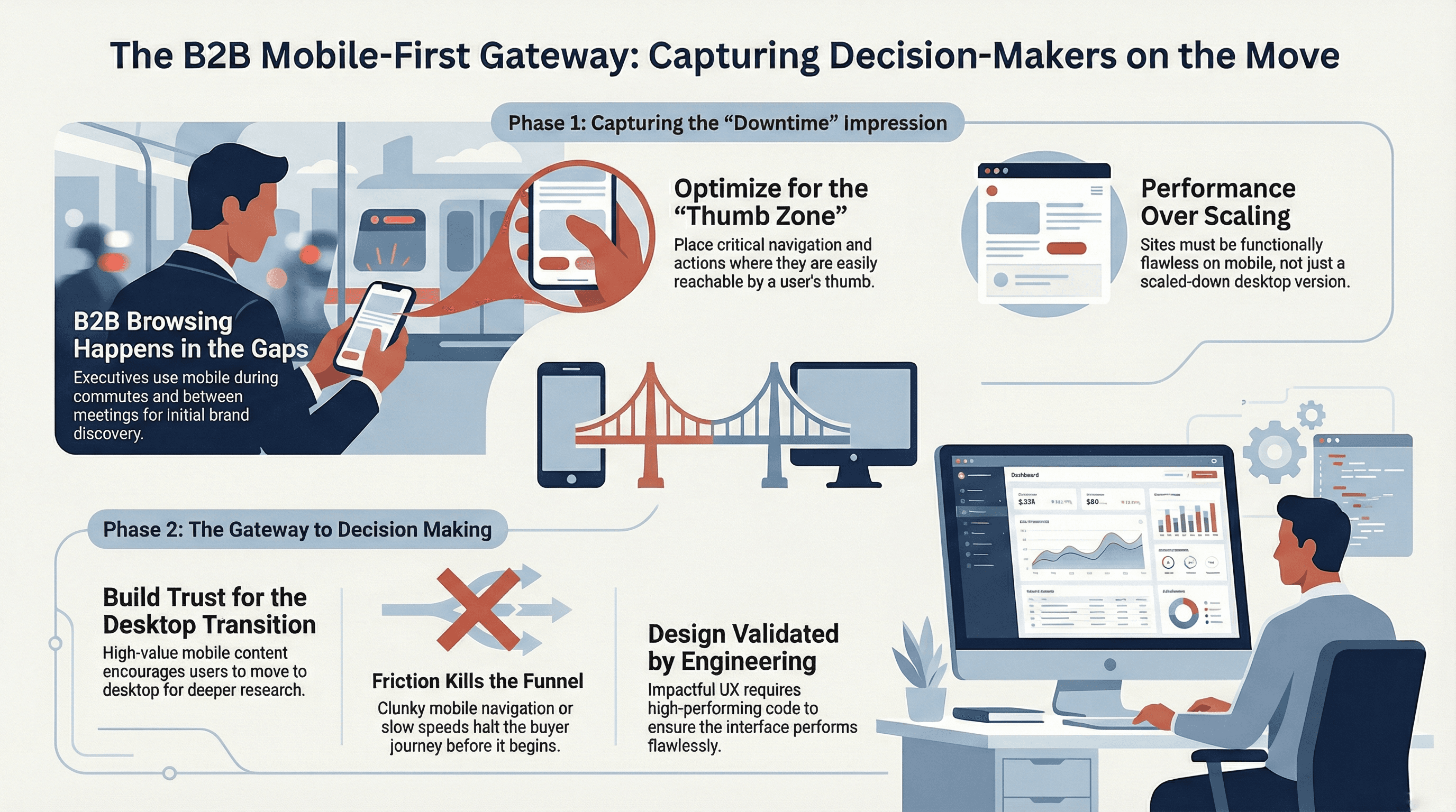
For a long time, the thinking was simple: B2B buyers used desktops, while B2C customers were on mobile. This idea is outdated. We see executives constantly browsing on their phones during downtime – commuting, waiting for meetings, or even just a quick check between tasks. This means the initial impression of your brand often happens on a smaller screen.
Capturing Attention on the Go
Think about how you use your own phone. You want quick answers, easy navigation, and a clear path to what you need. B2B decision-makers are no different. They're looking for solutions, and if your mobile site is clunky, slow, or hard to navigate, they'll simply move on. Your website needs to be functionally flawless on every device, not just a scaled-down version of your desktop site.
The Thumb Zone and Intuitive Navigation
Consider the 'thumb zone' – the area of a phone screen easily reachable by a user's thumb. Key actions and navigation elements should live here. This isn't just about aesthetics; it's about making it effortless for busy professionals to find information, watch a product demo, or contact your team. If they have to pinch, zoom, or struggle to tap small buttons, you've lost them. We help you design interfaces that anticipate these needs, making every interaction smooth and productive.
From Impression to Decision
While the initial discovery might happen on mobile, the deeper research and final decision often involve a desktop. This means your mobile experience isn't just a convenience; it's a critical gateway. It needs to build trust and provide enough value to encourage that transition to a more in-depth desktop engagement. A poor mobile experience can halt that journey before it even begins, regardless of how strong your desktop site is.
Truly impactful mobile-first design for B2B is more than just visuals; it requires a deep understanding of how users interact with technology. This understanding, combined with a clear vision, must then be translated into robust, high-performing code. It’s why great UX design needs equally great engineering to bring it to life and ensure it performs flawlessly.
Frequently Asked Questions
Need a better website strategy, but don't know where to start?
Answer 10 simple questions about your business, and we'll generate a personalized technical roadmap just for you. Free.
Get My Roadmap
Related posts

AI Website Design Flaws Often Hide Mobile Breakdowns
AI-generated layouts look good on a laptop, but often break on mobile. Learn why these AI Website Design Flaws lead to lost sales and poor user experience.

Unlock Revenue - Audit Your User Journey
Unlock the hidden potential of your website traffic. Our user journey audit finds conversion roadblocks, turning browsers into loyal customers.